Thursday, October 12, 2006

Blog #4: Subject Matter: Current Events

[1]

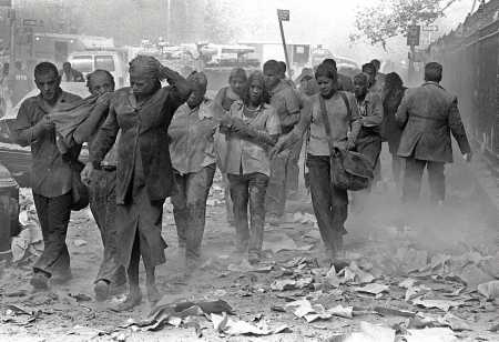
That morning, 19 terrorists[2] affiliated with al-Qaeda[3] hijacked four commercial passenger jet airliners. Each team of hijackers included a trained pilot. Two aircraft (United Airlines Flight 175 and American Airlines Flight 11) crashed into the World Trade Center in New York City, one plane into each tower (WTC 1 and WTC 2). Both towers collapsed within two hours, followed by WTC 7 later that day. The pilot of the third team crashed American Airlines Flight 77 into the Pentagon in Arlington County, Virginia. Passengers and members of the flight crew on the fourth aircraft (United Airlines Flight 93) attempted to retake control of their plane from the hijackers; that plane crashed into a field near the town of Shanksville in rural Somerset County, Pennsylvania. As well as the 19 hijackers, a confirmed 2,973 people died and another 24 are missing but presumed dead as a result of these attacks.
Just the fact that we knew about September 11 before hand, but did nothing about it intrests me even more into this current event. So many people died for being the most powerful country in the world, and since this happened we are now in war with Iraq. I have family members overseas fightening the war in Iraq, and it scares me that one day I will get a call saying they will not be coming home. I am upset to know that even though so many years have past, it doesn't seem like we will be leaving Iraq for another decade or so.

[2]

On April 19, 2005 Joseph Ratzinger of Germany waved to the crowd on Saint Peter's Square in Vatican City shortly after being elected pope. The new supreme leader of the Roman Catholic Church, who turned 78 on Saturday, chose to be called Pope Benedict XVI.
This topic of a new pope being elected because of the death of the late Pope John Paul II intrests me a lot. It doesn't happen in every lifetime that a pope gets elected. The process of waiting for black or white smoke to come out the chimney to alert the people of a new pop or not is amazing. I feel very connected to this topic mainly because I am Catholic. As a Catholic, I only hope to have the best leader to look up to and lead people. It is like the upcoming preseidential elections, or maybe for town mayor in my hometown. The whole process from seeing who can become a pope, to the pope standing outside that window in Rome is what I empathize most about this topic.


[3]

The Amish school shooting occurred on the morning of Monday, October 2, 2006, when a gunman took hostages and eventually killed five girls (aged 7–13) and himself at West Nickel Mines School, a one-room Amish schoolhouse in Nickel Mines, a village in Bart Township of Lancaster County, Pennsylvania, United States.[1][2][3][4][5] Police report that the gunman was Charles Carl Roberts IV,[5][6] a 32-year-old milk-tank truck driver who lived nearby.
This topic intrests me a lot because how often do you hear of poeople not liking the Amish? You never do, and nonetheless, this topic is about a guy who went into a school and shot five Amish girls. There are many issues behind the killing of these young girls. Some say the man had a grudge with the Amish community from something that happened 20 years ago. Others say that he was actually going to sexually assult the girls. I feel I have a personal connection with this topic because my family and i are good friends with some Amish up in Wooster, Ohio. We talked with them and they are very sad that it happened. One event that happened in my life that is similar to this is when I was in high school, we had a guy come in with a gun. We all had to deck down low, and people began to cry. We did not want to be like the Columbin students. I empathize most with the five girls that died from gun shots. They did nothing wrong and did not deserve any of it.


[4]


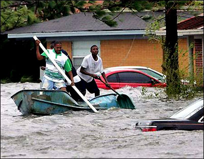
Hurricane Katrina was the costliest and one of the deadliest hurricanes in the history of the United States. It was the sixth-strongest Atlantic hurricane ever recorded and the third-strongest landfalling U.S. hurricane on record. Katrina formed in late August during the 2005 Atlantic hurricane season and caused devastation along much of the north-central Gulf Coast of the United States. Most notable in media coverage were the catastrophic effects on the city of New Orleans, Louisiana, and in coastal Mississippi. Due to its sheer size, Katrina devastated the Gulf Coast as far as 100 miles (160 km) from the storm's center.Katrina was the eleventh named storm, fifth hurricane, third major hurricane, and second Category 5 hurricane of the 2005 Atlantic season.
This topic intrests me because New Oreleans went from the home city of Mardi Gras, partying, livliness to death, sorrow, and hatred of mother nature in a brief minute. Then once this disaster was over, there were many allegations to President Bush that he did not act fast enough. The people of New Oreleans were living on the streets, and had no food or water to live on.I feel connected to this subject more than most people because my twin sister went down to New Orleans and helped with the clean up effort and rebuilding. She has pictures that wern't even on the media and that I believe no one should have to see again in their lifetime. I am very empathized most with the way New Orleans was handled. I believe we could of done more to help the people who were standed there with no food or water faster.


[5]

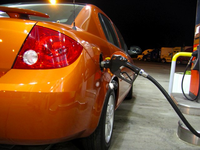
It all began with Septemeber 11th, when hijackers bombed the two World Trade Centers. From then on, gas prices soared to record highs from $3 to even $5 in some citites throughout the United States. We import our oil from overseas, even though we have enough oil in the United State to last us a lifetime. The only thing that stops us from getting it here in the US are the people that are trying to conserve the trees and animals that are ontop of the oil.
This topic intrests me beacuse its amazing how one event happens such as 9/11, and then a domino effect begins to happen with other things. I am a gas buyer, so I hav a personal connection with this topic. I use to be able to fill my car up with $10., but now it takes $20. Money that I would put towrds my education and future uses is now being put to filling up my car so I can get around.The part of the topic that I empathize most with is that it seems like oil companies are stealing our money, our hard earned money that we work for and just stuffing the money in their pockets.

Thursday, September 21, 2006

Blog Assignment #3: SUBJECT MATTER

As an artist, I will make a transition from assigned subject matter to subject matter of my own choosing. Artists tend to make art about something other than art, in other works, artists explore and research topics outside of the art world which serve to make their art more interesting. The following are images which relate to different topcs that I have an intrest in.


A lot of art work that I have created deals a lot with Africa and Kenya. When my twin sister went over to South Africa for a mission trip, she came back with tear dropping stories. The images of children seem to be my favorite because I feel that when you look into their eyes, you understand waht they are going through. I think when images like these are created, viewers HAVE to stop and study it.


If you first glance at the artwork, you don't think it is anything special. But Chuck Close paints his portriats with a unique style of combining colors and a grid form. I have done a portrait of my boyfriend in his style ( which seemed to take ages) and I plan on using his style more and more.


I am not sure if after high school years that pointallisms are cliche or not, but they intrest me enough to keep doing them. I've done over ten images of people in pointillisms, and even though they take just as long as the Chuck Close style; when you stop and look at it when you are completed....it was all well worth it. I think pointillisms with pin create a unique detail that not even pencil can create.


This image makes me smile every time I look at it because I couldn't even image how he did this. Mc Esher's unique style is a style that I am intrested in studing and trying to use as a lift to create my own style. His "eye picture" is also very intesting to me, and I have borrowed his idea and changed it for my own artwork.


Self portraits! This is something that as a future arist, that I hope to get better at. I believe something harder to draw other than people, is yourself.


I'm not really intrested in this image, but I am intrested in the subject: death. I am intrested in drawing what people don't want to see. Mainly because I don't know, and I belive other pople don't know what really goes on after death.


Images with childrens or babies hands against adults are very interesting to me. The hands show the life span from early birth to adulthood, which opens a wide variety of interpretations.


Since I grw up on a 76 acer farm, landscapes of farm settings seem to intrest me also. It is something that a lot of people think is an good subject in a painting because not everyone has lived on a farm. The picture gives them the sense that they have been on one..if you paint it right. ;)


Water drops and fluid I believe always make for interesting images. One because they are "see through", and two is because you can play with water or any fluids color to make it more interesting.


Lastly, I enjoy penciling, watercoloring, charcoling, sculpting, and even painting leaves. I think no matter what medium you use, the viewers naturally creates the color and texture of leaves because we have all jumped in a pile of them sometime inour lives. If you look closely, leaves have more detail that a lot of things in this crazy world.

Sunday, September 17, 2006

Blog Assignment #2: UNITY AND VARIETY

Before an artist begins a piece of artwork, there are many things he or she considers. One of them are the Principle of Design. They are given names such as unity and variety, contrast, emphasis, balance, movement, repetition and rhythm, and economy. The principles of design are used by artists to organize the so-called visual elements(lines, tones, shapes, textures, and colors) into a unified drawing. One of the elements I will be focusing on in this blog is unity and variety. Variety is the the diversity or multiplicity in an assortment, collection or group. Unity is the state of being unified or together as one. The following are five examples of using unity and variety effectively.


In, this artwork by Jacob Lawerence, he established visual themes with the lines, shapes, and colors of the train seats, figures, and luggage, and then he repeated and varied those themes. There is repetition in the green chair seats and window shades. As a unifying element, the same red is used in a variety of shapes. The many figures and objects in the complex composition form a unified design through the artist's skillful use of abstraction, theme, and variation."


Excitingly, I never thoguht Grant Wood's American Gothic would of variety and unity in it stil I researched it. The three-tined shape of the pitchfork in Wood's painting is repeated exactly in the clothing. It is also repeated in the windows and vertical lines in the house. On the other hand, curved shapes surround the woman's head - in the broach, curved edge of her dress and background trees. This repetition of shape unifies the painting, while the differences between the vertical and curved shapes give the painting a balancing sense of variety.


In this piece by Malcolm Harding, unity and variety is prominet. The many shapes of color keep your eye on the piece, exspecially the random blue circles. Harding created unity not only by using mellow, soft colors like pink, yellows, reds, and oranges, but by his grid-making through out the whole artwork. The grid unifies every element so that it appears on one plane.


Holly Clark's piece uses a variation of a grid system for her basis. The broken-image style breaks the piece into sections which gives a good variety to keep the viewer's eye on the page.The color and black and white throughout the painting gives a sense of unity. Nothing looks out of place.


In this artwork by Rudolph Russi, the many uses of color and style give much variation to the piece. The sense that he painted the buildings in a a way style instead of the normal, cliche straight buildings give a lot of variation to the painting, while still keeping unity. We, as the viewer, know if you have one building, its more than likely they are going to be more aorund it, therefore creating a town. A town is one, therefore creating unity. Also, Russi uses one light source that is used to capture all the buildings, making them more closely realated.


Though you need variety and unity in your artwork to make it more asethic, you can have too much an ineffective balance between unity and variety. These are images that are either boring because of lack of variety, or too chaotic because of too much. The followingare examples of ineffective balance of unity and variety.


This piece is a good example of too much unity. You may think the different colors in the background give some variety, but sense they used colors that every person knows, it doesn't work. They uses one shape through out the entire piece, a circle. There is nothing that keeps your eye on the art work.


This piece shows no variation, I believe, whatsoever.They used a smooth yellow for pears , but used a mellow orange for tomatoes. When I think of a tomoato I think of bright red.They used white for all the napkins; therefor giving no variation. The piece itself comes off to be boring because of the normal setting a lot of people paint these days.


In this case, the use of repeition does not give the effective use of unity the right way. It gives too much inity because it is the same element over and over again. It does not have much variety which doesn't give the viewer to interpret the piece in many ways than one.


This a great example of too much variety. There is so much going on, that you don't know where to look first. It doesn't seem to have an area of focus. There is so much little detail that you almost dont want to waste the time looking at it.


For my last part of my entry, this piece also has to much variety and unity. The same color scheme throughout, an the feeling of repeition does not give enough variety. The picture seems monotones and bland. It is not very eye appealing.

Saturday, September 02, 2006

Thursday, August 31, 2006

Positive versus Negative Space

In this positive/negative image it is difficult to determine which is the positive and which is the negative space. We call this kind of positive/negative image ambiguous space


When the figure and ground are equally well designed, every square inch of the image becomes engaged. In Bill Brant's photograph, the dark negative shapes define the positive figure while the brightly lit arm and face define the edges of the dark ground.


M.C. Esher was master of figure ground reversal. The figure ground reversal creates another kind of force, the positive and negative shapes fight for attention. Here, the white fish seem to be the positive space, but then as you move your eyes up the painting, the white fish become the negative space and the black birds become the postive.


This positive negative image uses figure ground reversal. The images have equal weight so they keep switching back and forth.The mad is black, but his hands are white and makes you wonder which is positive and whichi is negative.


If you don't understand postive and negative space in the other images, you should in this simple picture. The black chairs are the positive space, and the white background around the chairs is the negative space.


This image is a high positive/negative reversal. In this picture. the image seems to be cut out, and then fac which is black goes through a perceptual shift. The face, which should be the positive space, shows to be the background.


In this image, there is a big sign of figure ground universal. The face on the women tends to switch from the negative image to the positive because of her different colored hair.


Not only is the positive negative technique used in art work, but logs and designs also. Here, the white L is te positive and the black is the negative. but on the A, the black is the positive, and the white is the negative.


I think everyone knows what this image is, and I bet alot of people don't realize that this is also a form of negative and positive space. You can't really tell which is positive and which is negative because both parts make of the image.


Positve and negative images also don't always ahve to be black and white. In this picture of a bike, the bike is the positive space, the background is the negative. Even the space between the wires in the wheel is the negative space.